Ciara Murray AS
Monday, 23 April 2012
Note to the moderator
Welcome to the blog for my AS coursework this blog will evidence my skills progression and development of ideas from the first week of AS until now when I am submitting my final piece.
The main task for this unit was to research plan and design a website for a campaign and I chose to campaign against domestic violence against women. I found the task quite a challenge as I had to design my site from a blank page in iWeb and it also involved a lot of work involving photography and photoshop. iWeb is 'what you see is what you get' (wysiwyg) software so I didn't have to learn any html codes, my challenge instead was in the creation of the brand and constructing a functioning website which looked believable. I have tried to create something which looks original and will appeal to women aged 16 - 35, so it has a younger, more welcoming feel than other similar sites I have looked at.
My Evaluation
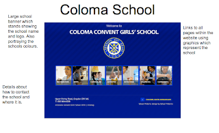
Other conventions such as blocks used to link to other pages are used as a large icon.
2. My website is a domestic violence website specifically aimed at females so you could say that my website represents a particular social group of women who have unfortunately been abused by their partners. I was going to have the website consisting of domestic violence for both genders but as most domestic violence cases are to do with men over women I decided to make it a website just for women. The power of women comes across so much more when it is aimed at just females. I think this makes the aim of the website much stronger. The website is aimed at all different classes and ethnicities but this probably isn't represented as well as it should be on the site because the images of females are predominantly middle class and white. When I was constructing the site I thought I was aiming it at all women but I can see that it wouldn't appeal to all women because the age range represented is only about 17 - 35. This would exclude women above that age group so if I was to do it again I would try and represent a wider demographic. The pictures on my website are mostly of happy females because it mostly represents happy females who have been though some difficulty, maybe in a past relationship, and come out on top. This is a convention of campaign sites - they show people who they helped or images of people who represent people they have helped instead of people who are still struggling. The unhappy girl on my site represents what the consequences are of domestic violence. This is unusual though because the website is promoting the good work of the campaign so images are typically positive.
3. Websites are distributed via servers and these are usually owned by just a few big companies. Here are the main server owners in the world in 2012:
Smaller webhosting companies rent space on these servers and sell hosting services to companies. The cost of web hosting depends on the size of your site and how much management and updating it needs.
Before you do that though you need to register a domain name for your site. I researched what I could get for my site and this is what i found:
I was interested to know how much beatit.co.uk would cost but it was already taken but the site suggested beatit.net and that would cost me $3,288 just to register that name and use it as my website address. So to be distributed my site would need a domain name and then the hosting costs depending on the final content size. As a charity I would probably be able to claim a lot of that money back.
4 & 5. The audience for my media product is women aged 16 - 35 who have been involved in domestic violence and need help in rebuilding their lives. The campaign is about seeking advice from women who have been through the issues themselves and know what they're going through. The whole aim of the website is that women unite to fight against domestic violence. I wanted the audience to feel as if they were part of a family and feel safe a comfortable to confide in our campaign. By having pictures of happy females all over the website advertising this is how I addressed the type of audience I wanted to attract. The colours of the website also connotes the idea that it's for women only so women would feel safe enough to pick up the phone and get in touch. The logo I've designed is like a little cartoon too so it would hopefully appeal to younger people - so they wouldn't feel like the campaign would turn them away because they're not older or not married. I hope the photographs I've used also communicate this idea, that it can happen to anyone. I think I should've been more specific about my target audience when I was making it though and then I could have done more to attract the 16 - 35 age group with the things I could advertise and the photos I would take.
6. This whole process has been a learning process for me because all of the software I have used was new to me when we started. Using iWeb for the first time was difficult at first because you have to start with a blank page and design something that looks like a real site. Until you really understand what real sites look like and how they're put together you can't really build your own, and this is why our preliminary site is so bad. Mostly everything has to be photoshopped before it goes onto the website and that was a new program to use as well and I had difficulty with it because I'd never used it before. I have learnt that during the process of this media product organisation is very important. Planning, preparation and research are the most important things. Without these, you can't make a good website.
7. I didn't do media for GCSE so all of the software is new to me and i've had to learn to use Photoshop, iWeb, Final Cut, Blogger and lots of other online things like dafont.com. I was able to use a combination of these to make my website so it was good to learn about them all. iWeb is called wysiwyg (what you see is what you get) software so it's all about the design and not the html code. I think it's complicated enough because the design is the hard part just like designing a poster or a magazine article. You have to learn to use all the tools and make everything do what you want through the inspector tool. You have to learn Photoshop too because there's not enough options for design in iWeb and you can't crop images so I had to make the documents the exact size I needed in Photoshop and then design them in there and insert the finished images into iWeb. I learned how to use the video cameras and the SLR cameras too and how to upload and edit using the software programmes. The blog was a good way of keeping everything organised but it's hard to keep it updated if you don't like to work that way. I just like to get on with things and then upload them when they're finished. This has taught me how to look at my work and analyse it though so I hope that will help me for A2.
Sunday, 22 April 2012
Thursday, 5 January 2012
Photography
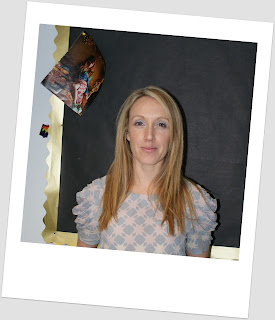
A friendly face of a team member makes the visitors feel comfortable in visiting the website and joining the team.
I have used one of my teachers at school as my chief executive. Another friendly face that will make the visitors want to visit the website and join the team.
I used this picture as an example of what can happen during domestic violence and that the consequences are serious.
Monday, 12 December 2011
 Before I started filling in my website with all the campaign details and domestic violence awareness I designed a template that I could use for each page on my website. This makes things easier for myself and saves me building another template that will match the others, it will make the website neater in general. I was originally going to only put the logo I designed on the front page and make it a larger size. Instead I decided to put it on all of the pages because it looks effective.
 Tuesday, 6 December 2011
Discovering font titles
For a suitable font for my website I went on dafont.com and looked through all the different styles it had on the website. I thought the font 'capture it' is the one that suited a domestic violence website. I then added the font onto photo shop to produce my titles.
Tuesday, 22 November 2011
Website Logo
I designed a logo which I personally thought was quite clever for a domestic violence website 'an angry heart'. The colour scheme of red and pink I think is suitable for a domestic violence website through the blatent issue of love or love gone wrong. I chose them to match the colour scheme of the website and coloured my logo in on photo shop. My skills in photoshop have definitely improved because I wouldn't have been able to colour in my angry heart without any practice. I wanted a logo on my website because when I went on other domestic violence websites they had their own logo on the page and I thought it was quite effective.
Tuesday, 15 November 2011
Monday, 14 November 2011
Website brief
I am creating a campaign website which will be featured on the issue of domestic violence. This website will consist of four pages including a home page. The issue of domestic violence is a problem that has exculated in teenage and adult relationships. The only way to stop the problem from getting worse is to stand up and stop it by building websites such as mine which will point out the problem of domestic violence, inform people on domestic violence, campaign against domestic violence by bringing people together and support eachother to stop this growing problem.
Thursday, 10 November 2011
Survey
We put a survey together to think about what it would be like to research before designing a real website. We considered what would be important for us to know:
Friday, 28 October 2011
Friday, 21 October 2011
Wednesday, 19 October 2011
School Website Brief
I will create a website for Cherry Tree Secondary. The school has been taken over and wants a new outlook. The design of my website will have a modern stylish look to it and have the littlest amount of information possible so that it is easy to find and read. By carrying out the survey I have decided to use the school colours so that it is recognizable. I will use a conventional layout using a master head with the school name and image. Also I will incorporate images and videos of the school and activities that the school does. I will have a main menu linking to other pages of relevance to the school such as, subjects. The website will also use badges at the bottom of the page which represent the school. Other useful information will be used on the main page to help users such as the time and a calendar.
Friday, 14 October 2011
Research into domain name and hosting
Before I started making my website it was important to research about the domain name of a website and website hosting.
What is website hosting?
A web host is needed to host a website as web hosting allows individuals and organisations to access their website on the world wide web, it is a type of Internet hosting service. The company normally charges you to use their server to host a website so others can access it. As my website is campaigning against domestic violence and is a charity website researching for the cheapest hosting server is important so funds for the charity will increase rather than spending the profit on hosting the website. Some web hosts are free but when they are free not everything is offered to make your website the best. The more money that is paid for the website the better the website is because it will have more features.
I would go for a medium amount to spend on my website rather than a free one because they don't have many functions to offer and wouldn't benefit the website just like having a really expensive host wouldn't benefit the charity. The web host server that appealed to me was www.justhost.com which offers web hosting from £1.95 a month rather than the usual amount of £4.95. I feel that this web hosting server offers a decent amount of functions for my website at a reasonable price.
What is a domain?
A domain is basically the name of the website either ending in .co.uk or .com. The domain can be used along side the web host making sure that no other website has the domain name. A domain name is important because it allows people to simply type in the domain website address to access the website.
Subscribe to:
Comments (Atom)


